registry/default/ui/empty.tsx
empty
npx shadcn@latest add @coss/empty registry/default/ui/fieldset.tsx
fieldset
@base-ui/react
npx shadcn@latest add @coss/fieldset fonts.tsx
fonts
font-sans font-heading font-mono
npx shadcn@latest add @coss/fonts registry/default/ui/input-group.tsx
input-group
npx shadcn@latest add @coss/input-group registry/default/ui/kbd.tsx
kbd
npx shadcn@latest add @coss/kbd registry/default/ui/meter.tsx
meter
@base-ui/react
npx shadcn@latest add @coss/meter registry/default/particles/p-accordion-1.tsx
p-accordion-1
Basic accordion
block
npx shadcn@latest add @coss/p-accordion-1 registry/default/particles/p-accordion-2.tsx
p-accordion-2
Accordion with one panel open
block
npx shadcn@latest add @coss/p-accordion-2 registry/default/particles/p-accordion-3.tsx
p-accordion-3
Accordion allowing multiple panels open
block
npx shadcn@latest add @coss/p-accordion-3 registry/default/particles/p-accordion-4.tsx
p-accordion-4
Controlled accordion
block
npx shadcn@latest add @coss/p-accordion-4 registry/default/particles/p-alert-1.tsx
p-alert-1
Basic alert
block
npx shadcn@latest add @coss/p-alert-1 registry/default/particles/p-alert-2.tsx
p-alert-2
Alert with icon
block lucide-react
npx shadcn@latest add @coss/p-alert-2 registry/default/particles/p-alert-3.tsx
p-alert-3
Alert with icon and action buttons
block lucide-react
npx shadcn@latest add @coss/p-alert-3 registry/default/particles/p-alert-4.tsx
p-alert-4
Info alert
block lucide-react
npx shadcn@latest add @coss/p-alert-4 registry/default/particles/p-alert-5.tsx
p-alert-5
Success alert
block lucide-react
npx shadcn@latest add @coss/p-alert-5 registry/default/particles/p-alert-6.tsx
p-alert-6
Warning alert
block lucide-react
npx shadcn@latest add @coss/p-alert-6 registry/default/particles/p-alert-7.tsx
p-alert-7
Error alert
block lucide-react
npx shadcn@latest add @coss/p-alert-7 registry/default/particles/p-alert-dialog-1.tsx
p-alert-dialog-1
Alert dialog
block
npx shadcn@latest add @coss/p-alert-dialog-1 registry/default/particles/p-alert-dialog-2.tsx
p-alert-dialog-2
Alert dialog with bare footer
block
npx shadcn@latest add @coss/p-alert-dialog-2 registry/default/particles/p-autocomplete-1.tsx
p-autocomplete-1
Basic autocomplete
block
npx shadcn@latest add @coss/p-autocomplete-1 registry/default/particles/p-autocomplete-10.tsx
p-autocomplete-10
Autocomplete with grouped items
block
npx shadcn@latest add @coss/p-autocomplete-10 registry/default/particles/p-autocomplete-11.tsx
p-autocomplete-11
Autocomplete with limited number of results
block
npx shadcn@latest add @coss/p-autocomplete-11 registry/default/particles/p-autocomplete-12.tsx
p-autocomplete-12
Autocomplete with async items loading
block spinner
npx shadcn@latest add @coss/p-autocomplete-12 registry/default/particles/p-autocomplete-13.tsx
p-autocomplete-13
Autocomplete form
block
npx shadcn@latest add @coss/p-autocomplete-13 registry/default/particles/p-autocomplete-14.tsx
p-autocomplete-14
Autocomplete form
block
npx shadcn@latest add @coss/p-autocomplete-14 registry/default/particles/p-autocomplete-15.tsx
p-autocomplete-15
Pill-shaped autocomplete
block
npx shadcn@latest add @coss/p-autocomplete-15 registry/default/particles/p-autocomplete-16.tsx
p-autocomplete-16
Address autocomplete with Google Maps Places API
block lucide-react
npx shadcn@latest add @coss/p-autocomplete-16 registry/default/particles/p-autocomplete-2.tsx
p-autocomplete-2
Disabled autocomplete
block
npx shadcn@latest add @coss/p-autocomplete-2 registry/default/particles/p-autocomplete-3.tsx
p-autocomplete-3
Small autocomplete
block
npx shadcn@latest add @coss/p-autocomplete-3 registry/default/particles/p-autocomplete-4.tsx
p-autocomplete-4
Large autocomplete
block
npx shadcn@latest add @coss/p-autocomplete-4 registry/default/particles/p-autocomplete-5.tsx
p-autocomplete-5
Autocomplete with label
block
npx shadcn@latest add @coss/p-autocomplete-5 registry/default/particles/p-autocomplete-6.tsx
p-autocomplete-6
Autocomplete autofilling the input with the highlighted item
block
npx shadcn@latest add @coss/p-autocomplete-6 registry/default/particles/p-autocomplete-7.tsx
p-autocomplete-7
Autocomplete auto highlighting the first option
block
npx shadcn@latest add @coss/p-autocomplete-7 registry/default/particles/p-autocomplete-8.tsx
p-autocomplete-8
Autocomplete with clear button
block
npx shadcn@latest add @coss/p-autocomplete-8 registry/default/particles/p-autocomplete-9.tsx
p-autocomplete-9
Autocomplete with trigger and clear buttons
block
npx shadcn@latest add @coss/p-autocomplete-9 registry/default/particles/p-avatar-1.tsx
p-avatar-1
Avatar with image and fallback
block
npx shadcn@latest add @coss/p-avatar-1 registry/default/particles/p-avatar-10.tsx
p-avatar-10
Avatar with notification badge
block
npx shadcn@latest add @coss/p-avatar-10 registry/default/particles/p-avatar-11.tsx
p-avatar-11
Rounded avatar with notification badge
block
npx shadcn@latest add @coss/p-avatar-11 registry/default/particles/p-avatar-12.tsx
p-avatar-12
Avatar with verified badge
block
npx shadcn@latest add @coss/p-avatar-12 registry/default/particles/p-avatar-13.tsx
p-avatar-13
Small overlapping avatar group
block
npx shadcn@latest add @coss/p-avatar-13 registry/default/particles/p-avatar-14.tsx
p-avatar-14
Large overlapping avatar group
block
npx shadcn@latest add @coss/p-avatar-14 registry/default/particles/p-avatar-2.tsx
p-avatar-2
Fallback-only avatar
block
npx shadcn@latest add @coss/p-avatar-2 registry/default/particles/p-avatar-3.tsx
p-avatar-3
Avatars with different sizes
block
npx shadcn@latest add @coss/p-avatar-3 registry/default/particles/p-avatar-4.tsx
p-avatar-4
Avatars with different radii
block
npx shadcn@latest add @coss/p-avatar-4 registry/default/particles/p-avatar-5.tsx
p-avatar-5
Overlapping avatar group
block
npx shadcn@latest add @coss/p-avatar-5 registry/default/particles/p-avatar-6.tsx
p-avatar-6
Avatar with user icon fallback
block lucide-react
npx shadcn@latest add @coss/p-avatar-6 registry/default/particles/p-avatar-7.tsx
p-avatar-7
Avatar with emerald status dot
block
npx shadcn@latest add @coss/p-avatar-7 registry/default/particles/p-avatar-8.tsx
p-avatar-8
Avatar with muted status dot
block
npx shadcn@latest add @coss/p-avatar-8 registry/default/particles/p-avatar-9.tsx
p-avatar-9
Rounded avatar with top-right emerald status
block
npx shadcn@latest add @coss/p-avatar-9 registry/default/particles/p-badge-1.tsx
p-badge-1
Basic badge
block
npx shadcn@latest add @coss/p-badge-1 registry/default/particles/p-badge-10.tsx
p-badge-10
Large badge
block
npx shadcn@latest add @coss/p-badge-10 registry/default/particles/p-badge-11.tsx
p-badge-11
Badge with icon
block lucide-react
npx shadcn@latest add @coss/p-badge-11 registry/default/particles/p-badge-12.tsx
p-badge-12
Badge with link
block
npx shadcn@latest add @coss/p-badge-12 registry/default/particles/p-badge-13.tsx
p-badge-13
Badge with count
block
npx shadcn@latest add @coss/p-badge-13 registry/default/particles/p-badge-14.tsx
p-badge-14
Full rounded badge (pill)
block
npx shadcn@latest add @coss/p-badge-14 registry/default/particles/p-badge-15.tsx
p-badge-15
Badge with number after text
block
npx shadcn@latest add @coss/p-badge-15 registry/default/particles/p-badge-16.tsx
p-badge-16
Status badge - Paid
block
npx shadcn@latest add @coss/p-badge-16 registry/default/particles/p-badge-17.tsx
p-badge-17
Status badge - Pending
block
npx shadcn@latest add @coss/p-badge-17 registry/default/particles/p-badge-18.tsx
p-badge-18
Status badge - Failed
block
npx shadcn@latest add @coss/p-badge-18 registry/default/particles/p-badge-19.tsx
p-badge-19
Selectable badge with checkbox
block lucide-react
npx shadcn@latest add @coss/p-badge-19 registry/default/particles/p-badge-2.tsx
p-badge-2
Outline badge
block
npx shadcn@latest add @coss/p-badge-2 registry/default/particles/p-badge-20.tsx
p-badge-20
Removable badge
block lucide-react
npx shadcn@latest add @coss/p-badge-20 registry/default/particles/p-badge-3.tsx
p-badge-3
Secondary badge
block
npx shadcn@latest add @coss/p-badge-3 registry/default/particles/p-badge-4.tsx
p-badge-4
Destructive badge
block
npx shadcn@latest add @coss/p-badge-4 registry/default/particles/p-badge-5.tsx
p-badge-5
Info badge
block
npx shadcn@latest add @coss/p-badge-5 registry/default/particles/p-badge-6.tsx
p-badge-6
Success badge
block
npx shadcn@latest add @coss/p-badge-6 registry/default/particles/p-badge-7.tsx
p-badge-7
Warning badge
block
npx shadcn@latest add @coss/p-badge-7 registry/default/particles/p-badge-8.tsx
p-badge-8
Error badge
block
npx shadcn@latest add @coss/p-badge-8 registry/default/particles/p-badge-9.tsx
p-badge-9
Small badge
block
npx shadcn@latest add @coss/p-badge-9 registry/default/particles/p-breadcrumb-1.tsx
p-breadcrumb-1
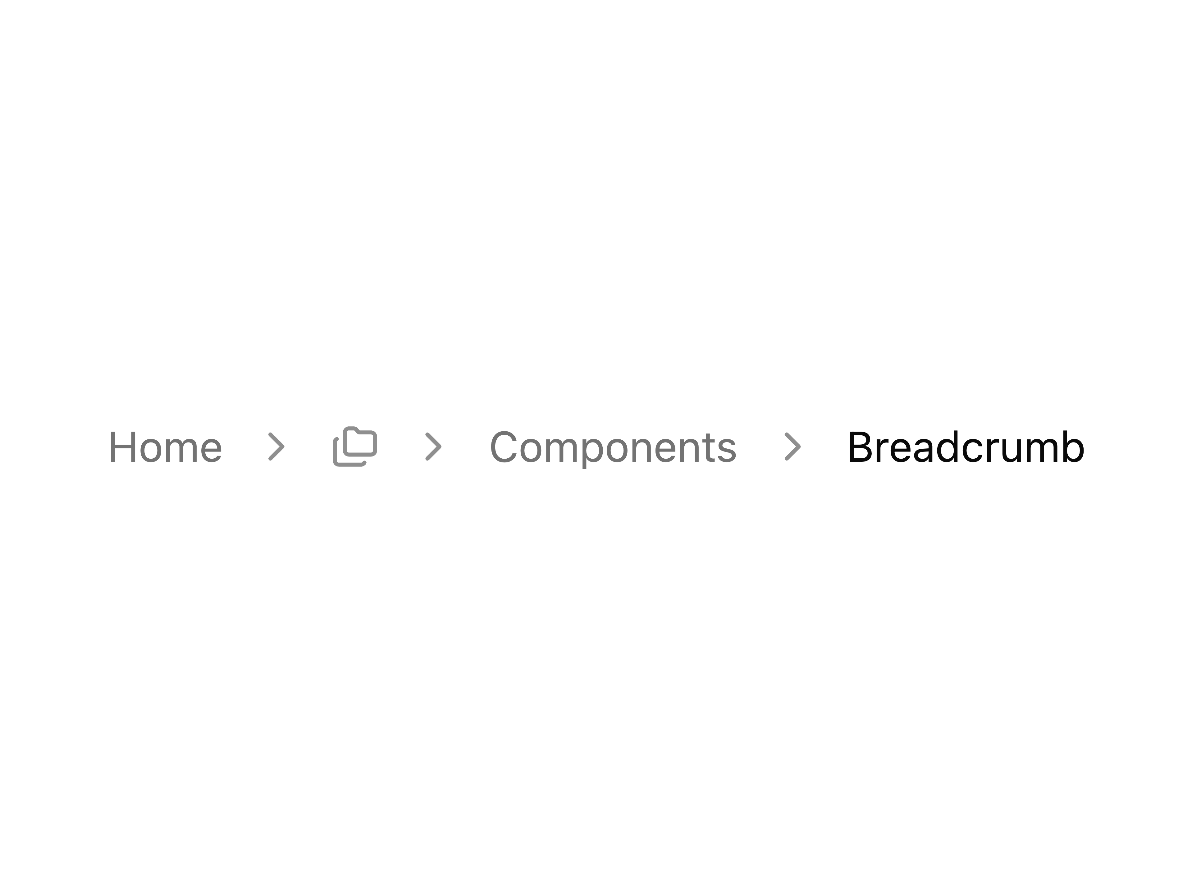
Breadcrumb with menu example
block
npx shadcn@latest add @coss/p-breadcrumb-1 registry/default/particles/p-breadcrumb-2.tsx
p-breadcrumb-2
Breadcrumb with custom separator
block
npx shadcn@latest add @coss/p-breadcrumb-2 registry/default/particles/p-breadcrumb-3.tsx
p-breadcrumb-3
Breadcrumb with home icon for home link only
block lucide-react
npx shadcn@latest add @coss/p-breadcrumb-3 registry/default/particles/p-breadcrumb-4.tsx
p-breadcrumb-4
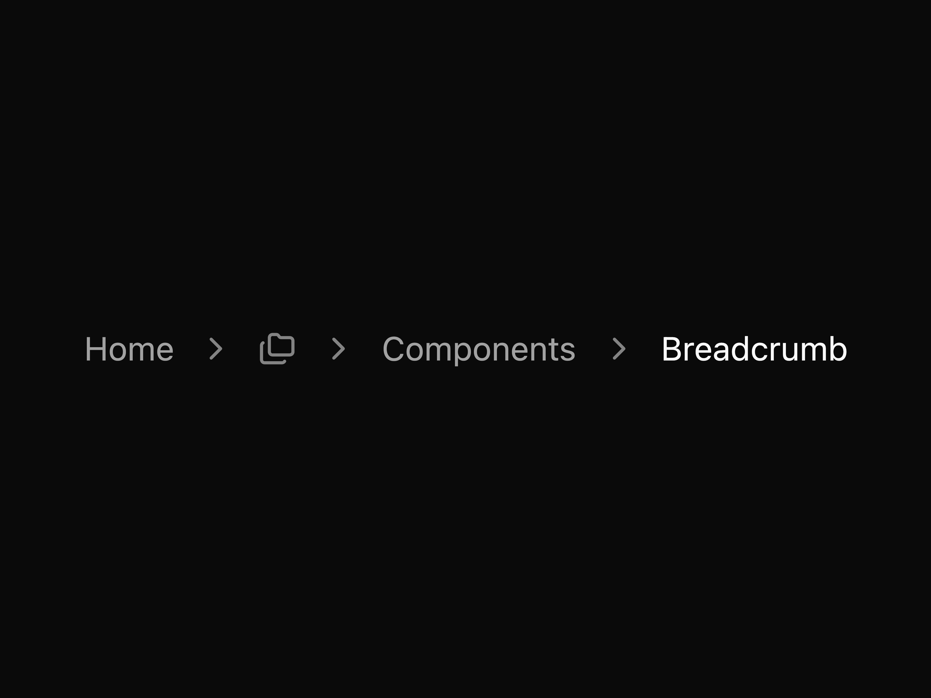
Breadcrumb with folders icon menu
block lucide-react
npx shadcn@latest add @coss/p-breadcrumb-4 registry/default/particles/p-breadcrumb-5.tsx
p-breadcrumb-5
Breadcrumb with icons before text
block lucide-react
npx shadcn@latest add @coss/p-breadcrumb-5 registry/default/particles/p-breadcrumb-6.tsx
p-breadcrumb-6
Breadcrumb with dot separators
block lucide-react
npx shadcn@latest add @coss/p-breadcrumb-6 registry/default/particles/p-breadcrumb-7.tsx
p-breadcrumb-7
Breadcrumb with select dropdown
block lucide-react
npx shadcn@latest add @coss/p-breadcrumb-7 registry/default/particles/p-button-1.tsx
p-button-1
Default button
block
npx shadcn@latest add @coss/p-button-1 registry/default/particles/p-button-10.tsx
p-button-10
Large button
block
npx shadcn@latest add @coss/p-button-10 registry/default/particles/p-button-11.tsx
p-button-11
Extra-large button
block
npx shadcn@latest add @coss/p-button-11 registry/default/particles/p-button-12.tsx
p-button-12
Disabled button
block
npx shadcn@latest add @coss/p-button-12 registry/default/particles/p-button-13.tsx
p-button-13
Icon button
block lucide-react
npx shadcn@latest add @coss/p-button-13 registry/default/particles/p-button-14.tsx
p-button-14
Small icon button
block lucide-react
npx shadcn@latest add @coss/p-button-14 registry/default/particles/p-button-15.tsx
p-button-15
Large icon button
block lucide-react
npx shadcn@latest add @coss/p-button-15 registry/default/particles/p-button-16.tsx
p-button-16
Button with icon
block lucide-react
npx shadcn@latest add @coss/p-button-16 registry/default/particles/p-button-17.tsx
p-button-17
Link rendered as button
block
npx shadcn@latest add @coss/p-button-17 registry/default/particles/p-button-18.tsx
p-button-18
Custom loading button with manual Spinner
block spinner
npx shadcn@latest add @coss/p-button-18 registry/default/particles/p-button-19.tsx
p-button-19
Expandable show more/less toggle button
block lucide-react
npx shadcn@latest add @coss/p-button-19 registry/default/particles/p-button-2.tsx
p-button-2
Outline button
block
npx shadcn@latest add @coss/p-button-2 registry/default/particles/p-button-20.tsx
p-button-20
Back link button with chevron
block lucide-react
npx shadcn@latest add @coss/p-button-20 registry/default/particles/p-button-21.tsx
p-button-21
Card-style button with heading and description
block lucide-react
npx shadcn@latest add @coss/p-button-21 registry/default/particles/p-button-22.tsx
p-button-22
Directional pad control buttons
block lucide-react
npx shadcn@latest add @coss/p-button-22 registry/default/particles/p-button-23.tsx
p-button-23
Outline like button with count
block lucide-react
npx shadcn@latest add @coss/p-button-23 registry/default/particles/p-button-24.tsx
p-button-24
Social login icon buttons
block @remixicon/react
npx shadcn@latest add @coss/p-button-24 registry/default/particles/p-button-26.tsx
p-button-26
Star button with count badge
block lucide-react
npx shadcn@latest add @coss/p-button-26 registry/default/particles/p-button-27.tsx
p-button-27
Button group with QR code icon and sign in
block lucide-react
npx shadcn@latest add @coss/p-button-27 registry/default/particles/p-button-28.tsx
p-button-28
Button with avatar
block
npx shadcn@latest add @coss/p-button-28 registry/default/particles/p-button-29.tsx
p-button-29
Pill-shaped button with rounded-full styling
block
npx shadcn@latest add @coss/p-button-29 registry/default/particles/p-button-3.tsx
p-button-3
Secondary button
block
npx shadcn@latest add @coss/p-button-3 registry/default/particles/p-button-30.tsx
p-button-30
Button with animated arrow on hover
block lucide-react
npx shadcn@latest add @coss/p-button-30 registry/default/particles/p-button-31.tsx
p-button-31
Button with keyboard shortcut indicator
block lucide-react
npx shadcn@latest add @coss/p-button-31 registry/default/particles/p-button-32.tsx
p-button-32
Button with notification badge
block
npx shadcn@latest add @coss/p-button-32 registry/default/particles/p-button-33.tsx
p-button-33
Paired buttons (Cancel/Save)
block
npx shadcn@latest add @coss/p-button-33 registry/default/particles/p-button-34.tsx
p-button-34
Button with animated status dot
block
npx shadcn@latest add @coss/p-button-34 registry/default/particles/p-button-35.tsx
p-button-35
Icon-only copy button with feedback
block lucide-react
npx shadcn@latest add @coss/p-button-35 registry/default/particles/p-button-36.tsx
p-button-36
Copy button with feedback
block lucide-react
npx shadcn@latest add @coss/p-button-36 registry/default/particles/p-button-37.tsx
p-button-37
Rotating icon button (FAB-style toggle)
block lucide-react
npx shadcn@latest add @coss/p-button-37 registry/default/particles/p-button-38.tsx
p-button-38
Social login buttons (Google, X, GitHub)
block @remixicon/react
npx shadcn@latest add @coss/p-button-38 registry/default/particles/p-button-39.tsx
p-button-39
Hamburger menu button with animated icon
block
npx shadcn@latest add @coss/p-button-39 registry/default/particles/p-button-4.tsx
p-button-4
Destructive button
block
npx shadcn@latest add @coss/p-button-4 registry/default/particles/p-button-40.tsx
p-button-40
Download button with progress and cancel action
block lucide-react
npx shadcn@latest add @coss/p-button-40 registry/default/particles/p-button-41.tsx
p-button-41
Button using the built-in loading prop
block
npx shadcn@latest add @coss/p-button-41 registry/default/particles/p-button-5.tsx
p-button-5
Destructive outline button
block
npx shadcn@latest add @coss/p-button-5 registry/default/particles/p-button-6.tsx
p-button-6
Ghost button
block
npx shadcn@latest add @coss/p-button-6 registry/default/particles/p-button-7.tsx
p-button-7
Link button
block
npx shadcn@latest add @coss/p-button-7 registry/default/particles/p-button-8.tsx
p-button-8
Extra-small button
block
npx shadcn@latest add @coss/p-button-8 registry/default/particles/p-button-9.tsx
p-button-9
Small button
block
npx shadcn@latest add @coss/p-button-9 registry/default/particles/p-calendar-1.tsx
p-calendar-1
Basic calendar
block
npx shadcn@latest add @coss/p-calendar-1 registry/default/particles/p-calendar-10.tsx
p-calendar-10
Calendar with rounded range selection style
block date-fns
npx shadcn@latest add @coss/p-calendar-10 registry/default/particles/p-calendar-11.tsx
p-calendar-11
Calendar with right-aligned navigation
block
npx shadcn@latest add @coss/p-calendar-11 registry/default/particles/p-calendar-12.tsx
p-calendar-12
Calendar with week numbers
block
npx shadcn@latest add @coss/p-calendar-12 registry/default/particles/p-calendar-13.tsx
p-calendar-13
Calendar with year-only combobox dropdown
block
npx shadcn@latest add @coss/p-calendar-13 registry/default/particles/p-calendar-14.tsx
p-calendar-14
Calendar without arrow navigation (dropdown only)
block
npx shadcn@latest add @coss/p-calendar-14 registry/default/particles/p-calendar-15.tsx
p-calendar-15
Calendar with current month button
block date-fns
npx shadcn@latest add @coss/p-calendar-15 registry/default/particles/p-calendar-16.tsx
p-calendar-16
Calendar with today button
block date-fns
npx shadcn@latest add @coss/p-calendar-16 registry/default/particles/p-calendar-17.tsx
p-calendar-17
Calendar with date input
block date-fns lucide-react
npx shadcn@latest add @coss/p-calendar-17 registry/default/particles/p-calendar-18.tsx
p-calendar-18
Calendar with time input
block lucide-react
npx shadcn@latest add @coss/p-calendar-18 registry/default/particles/p-calendar-19.tsx
p-calendar-19
Calendar with time slots (appointment picker)
block date-fns
npx shadcn@latest add @coss/p-calendar-19 registry/default/particles/p-calendar-2.tsx
p-calendar-2
Calendar with custom cell size
block
npx shadcn@latest add @coss/p-calendar-2 registry/default/particles/p-calendar-20.tsx
p-calendar-20
Calendar with date presets
block date-fns
npx shadcn@latest add @coss/p-calendar-20 registry/default/particles/p-calendar-21.tsx
p-calendar-21
Range calendar with date presets
block date-fns
npx shadcn@latest add @coss/p-calendar-21 registry/default/particles/p-calendar-22.tsx
p-calendar-22
Two months calendar
block date-fns
npx shadcn@latest add @coss/p-calendar-22 registry/default/particles/p-calendar-23.tsx
p-calendar-23
Three months calendar
block date-fns
npx shadcn@latest add @coss/p-calendar-23 registry/default/particles/p-calendar-24.tsx
p-calendar-24
Pricing calendar with custom day buttons
block date-fns
npx shadcn@latest add @coss/p-calendar-24 registry/default/particles/p-calendar-25.tsx
p-calendar-25
Calendar with 24-hour autocomplete time input
block date-fns lucide-react
npx shadcn@latest add @coss/p-calendar-25 registry/default/particles/p-calendar-3.tsx
p-calendar-3
Calendar with date range selection
block
npx shadcn@latest add @coss/p-calendar-3 registry/default/particles/p-calendar-4.tsx
p-calendar-4
Calendar with month/year dropdown navigation
block
npx shadcn@latest add @coss/p-calendar-4 registry/default/particles/p-calendar-5.tsx
p-calendar-5
Calendar with custom Select dropdown for month/year
block
npx shadcn@latest add @coss/p-calendar-5 registry/default/particles/p-calendar-6.tsx
p-calendar-6
Calendar with Combobox dropdown for month/year
block lucide-react
npx shadcn@latest add @coss/p-calendar-6 registry/default/particles/p-calendar-7.tsx
p-calendar-7
Calendar with disabled dates
block date-fns
npx shadcn@latest add @coss/p-calendar-7 registry/default/particles/p-calendar-8.tsx
p-calendar-8
Calendar with multiple date selection
block date-fns
npx shadcn@latest add @coss/p-calendar-8 registry/default/particles/p-calendar-9.tsx
p-calendar-9
Calendar with rounded day buttons
block
npx shadcn@latest add @coss/p-calendar-9 registry/default/particles/p-card-1.tsx
p-card-1
A basic card with header and footer
block lucide-react
npx shadcn@latest add @coss/p-card-1 registry/default/particles/p-card-10.tsx
p-card-10
Card within a frame with header and footer
block lucide-react
npx shadcn@latest add @coss/p-card-10 registry/default/particles/p-card-11.tsx
p-card-11
CardFrame with header action
block lucide-react
npx shadcn@latest add @coss/p-card-11 registry/default/particles/p-card-2.tsx
p-card-2
Authentication card with actions
block
npx shadcn@latest add @coss/p-card-2 registry/default/particles/p-card-3.tsx
p-card-3
Authentication card with separators
block lucide-react
npx shadcn@latest add @coss/p-card-3 registry/default/particles/p-card-4.tsx
p-card-4
Framed card with footer
block lucide-react
npx shadcn@latest add @coss/p-card-4 registry/default/particles/p-card-5.tsx
p-card-5
Framed card with header
block
npx shadcn@latest add @coss/p-card-5 registry/default/particles/p-card-6.tsx
p-card-6
Framed card with header and footer
block lucide-react
npx shadcn@latest add @coss/p-card-6 registry/default/particles/p-card-7.tsx
p-card-7
Framed card with no rounded bottom
block lucide-react
npx shadcn@latest add @coss/p-card-7 registry/default/particles/p-card-8.tsx
p-card-8
Card within a frame and footer
block
npx shadcn@latest add @coss/p-card-8 registry/default/particles/p-card-9.tsx
p-card-9
Card within a frame and footer
block lucide-react
npx shadcn@latest add @coss/p-card-9 registry/default/particles/p-checkbox-1.tsx
p-checkbox-1
Basic checkbox
block
npx shadcn@latest add @coss/p-checkbox-1 registry/default/particles/p-checkbox-2.tsx
p-checkbox-2
Disabled checkbox
block
npx shadcn@latest add @coss/p-checkbox-2 registry/default/particles/p-checkbox-3.tsx
p-checkbox-3
Checkbox with description
block
npx shadcn@latest add @coss/p-checkbox-3 registry/default/particles/p-checkbox-4.tsx
p-checkbox-4
Card-style checkbox
block
npx shadcn@latest add @coss/p-checkbox-4 registry/default/particles/p-checkbox-5.tsx
p-checkbox-5
Checkbox form
block
npx shadcn@latest add @coss/p-checkbox-5 registry/default/particles/p-checkbox-group-1.tsx
p-checkbox-group-1
Basic checkbox group
block
npx shadcn@latest add @coss/p-checkbox-group-1 registry/default/particles/p-checkbox-group-2.tsx
p-checkbox-group-2
Checkbox group with disabled items
block
npx shadcn@latest add @coss/p-checkbox-group-2 registry/default/particles/p-checkbox-group-3.tsx
p-checkbox-group-3
Checkbox group with parent checkbox
block
npx shadcn@latest add @coss/p-checkbox-group-3 registry/default/particles/p-checkbox-group-4.tsx
p-checkbox-group-4
Nested checkbox group with parent
block
npx shadcn@latest add @coss/p-checkbox-group-4 registry/default/particles/p-checkbox-group-5.tsx
p-checkbox-group-5
Checkbox group form
block
npx shadcn@latest add @coss/p-checkbox-group-5 registry/default/particles/p-collapsible-1.tsx
p-collapsible-1
Basic collapsible
block lucide-react
npx shadcn@latest add @coss/p-collapsible-1 registry/default/particles/p-combobox-1.tsx
p-combobox-1
Basic combobox
block
npx shadcn@latest add @coss/p-combobox-1 registry/default/particles/p-combobox-10.tsx
p-combobox-10
Combobox with input inside popup
block lucide-react
npx shadcn@latest add @coss/p-combobox-10 registry/default/particles/p-combobox-11.tsx
p-combobox-11
Combobox form
block
npx shadcn@latest add @coss/p-combobox-11 registry/default/particles/p-combobox-12.tsx
p-combobox-12
Combobox multiple form
block
npx shadcn@latest add @coss/p-combobox-12 registry/default/particles/p-combobox-13.tsx
p-combobox-13
Combobox with start addon
block lucide-react
npx shadcn@latest add @coss/p-combobox-13 registry/default/particles/p-combobox-14.tsx
p-combobox-14
Combobox multiple with start addon
block lucide-react
npx shadcn@latest add @coss/p-combobox-14 registry/default/particles/p-combobox-15.tsx
p-combobox-15
Pill-shaped combobox
block
npx shadcn@latest add @coss/p-combobox-15 registry/default/particles/p-combobox-16.tsx
p-combobox-16
Timezone combobox
block
npx shadcn@latest add @coss/p-combobox-16 registry/default/particles/p-combobox-17.tsx
p-combobox-17
Timezone combobox with search input
block lucide-react
npx shadcn@latest add @coss/p-combobox-17 registry/default/particles/p-combobox-18.tsx
p-combobox-18
Combobox with select trigger
block
npx shadcn@latest add @coss/p-combobox-18 registry/default/particles/p-combobox-19.tsx
p-combobox-19
Combobox multiple with stacked chips
block lucide-react
npx shadcn@latest add @coss/p-combobox-19 registry/default/particles/p-combobox-2.tsx
p-combobox-2
Disabled combobox
block
npx shadcn@latest add @coss/p-combobox-2 registry/default/particles/p-combobox-20.tsx
p-combobox-20
Combobox multiple with stacked divided chips
block lucide-react
npx shadcn@latest add @coss/p-combobox-20 registry/default/particles/p-combobox-3.tsx
p-combobox-3
Small combobox
block
npx shadcn@latest add @coss/p-combobox-3 registry/default/particles/p-combobox-4.tsx
p-combobox-4
Large combobox
block
npx shadcn@latest add @coss/p-combobox-4 registry/default/particles/p-combobox-5.tsx
p-combobox-5
Combobox with label
block
npx shadcn@latest add @coss/p-combobox-5 registry/default/particles/p-combobox-6.tsx
p-combobox-6
Combobox auto highlighting the first option
block
npx shadcn@latest add @coss/p-combobox-6 registry/default/particles/p-combobox-7.tsx
p-combobox-7
Combobox with clear button
block
npx shadcn@latest add @coss/p-combobox-7 registry/default/particles/p-combobox-8.tsx
p-combobox-8
Combobox with grouped items
block
npx shadcn@latest add @coss/p-combobox-8 registry/default/particles/p-combobox-9.tsx
p-combobox-9
Combobox with multiple selection
block
npx shadcn@latest add @coss/p-combobox-9 registry/default/particles/p-command-1.tsx
p-command-1
Command palette with dialog
block lucide-react
npx shadcn@latest add @coss/p-command-1 registry/default/particles/p-command-2.tsx
p-command-2
Command palette with AI assistant
block lucide-react
npx shadcn@latest add @coss/p-command-2 registry/default/particles/p-context-menu-1.tsx
p-context-menu-1
Basic context menu
block
npx shadcn@latest add @coss/p-context-menu-1 registry/default/particles/p-context-menu-2.tsx
p-context-menu-2
Context menu with link items
block
npx shadcn@latest add @coss/p-context-menu-2 registry/default/particles/p-context-menu-3.tsx
p-context-menu-3
Nested context menu
block
npx shadcn@latest add @coss/p-context-menu-3 registry/default/particles/p-context-menu-4.tsx
p-context-menu-4
Context menu with checkbox items
block
npx shadcn@latest add @coss/p-context-menu-4 registry/default/particles/p-context-menu-5.tsx
p-context-menu-5
Context menu with group labels
block
npx shadcn@latest add @coss/p-context-menu-5 registry/default/particles/p-context-menu-6.tsx
p-context-menu-6
Context menu with icons
block lucide-react
npx shadcn@latest add @coss/p-context-menu-6 registry/default/particles/p-context-menu-7.tsx
p-context-menu-7
Context menu with radio group
block
npx shadcn@latest add @coss/p-context-menu-7 registry/default/particles/p-context-menu-8.tsx
p-context-menu-8
Context menu with switch checkbox items
block
npx shadcn@latest add @coss/p-context-menu-8 registry/default/particles/p-date-picker-1.tsx
p-date-picker-1
Basic date picker
block date-fns lucide-react
npx shadcn@latest add @coss/p-date-picker-1 registry/default/particles/p-date-picker-2.tsx
p-date-picker-2
Date range picker
block date-fns lucide-react
npx shadcn@latest add @coss/p-date-picker-2 registry/default/particles/p-date-picker-3.tsx
p-date-picker-3
Date picker with field and dropdown navigation
block date-fns lucide-react
npx shadcn@latest add @coss/p-date-picker-3 registry/default/particles/p-date-picker-4.tsx
p-date-picker-4
Date picker with presets
block date-fns lucide-react
npx shadcn@latest add @coss/p-date-picker-4 registry/default/particles/p-date-picker-5.tsx
p-date-picker-5
Date picker with input
block date-fns lucide-react
npx shadcn@latest add @coss/p-date-picker-5 registry/default/particles/p-date-picker-6.tsx
p-date-picker-6
Date picker that closes on select
block date-fns lucide-react
npx shadcn@latest add @coss/p-date-picker-6 registry/default/particles/p-date-picker-7.tsx
p-date-picker-7
Multiple dates picker
block date-fns lucide-react
npx shadcn@latest add @coss/p-date-picker-7 registry/default/particles/p-date-picker-8.tsx
p-date-picker-8
Date picker with select-like trigger
block date-fns lucide-react
npx shadcn@latest add @coss/p-date-picker-8 registry/default/particles/p-date-picker-9.tsx
p-date-picker-9
Two months calendar with range date
block date-fns lucide-react
npx shadcn@latest add @coss/p-date-picker-9 registry/default/particles/p-dialog-1.tsx
p-dialog-1
Dialog with form
block
npx shadcn@latest add @coss/p-dialog-1 registry/default/particles/p-dialog-2.tsx
p-dialog-2
Dialog opened from menu
block
npx shadcn@latest add @coss/p-dialog-2 registry/default/particles/p-dialog-3.tsx
p-dialog-3
Nested dialogs
block
npx shadcn@latest add @coss/p-dialog-3 registry/default/particles/p-dialog-4.tsx
p-dialog-4
Dialog with close confirmation
block
npx shadcn@latest add @coss/p-dialog-4 registry/default/particles/p-dialog-5.tsx
p-dialog-5
Dialog with long content
block
npx shadcn@latest add @coss/p-dialog-5 registry/default/particles/p-dialog-6.tsx
p-dialog-6
Dialog with bare footer
block
npx shadcn@latest add @coss/p-dialog-6 registry/default/particles/p-drawer-1.tsx
p-drawer-1
Simple bottom drawer with close button
block
npx shadcn@latest add @coss/p-drawer-1 registry/default/particles/p-drawer-10.tsx
p-drawer-10
Edit profile form with default and bare footer variants
block
npx shadcn@latest add @coss/p-drawer-10 registry/default/particles/p-drawer-11.tsx
p-drawer-11
Mobile menu drawer from the left
block
npx shadcn@latest add @coss/p-drawer-11 registry/default/particles/p-drawer-12.tsx
p-drawer-12
Responsive edit profile: dialog on desktop, drawer on mobile
block use-media-query
npx shadcn@latest add @coss/p-drawer-12 registry/default/particles/p-drawer-13.tsx
p-drawer-13
Responsive actions menu: menu on desktop, drawer on mobile
block lucide-react
npx shadcn@latest add @coss/p-drawer-13 registry/default/particles/p-drawer-14.tsx
p-drawer-14
Left drawer with swipe area
block
npx shadcn@latest add @coss/p-drawer-14 registry/default/particles/p-drawer-2.tsx
p-drawer-2
Bottom drawer without drag bar
block
npx shadcn@latest add @coss/p-drawer-2 registry/default/particles/p-drawer-3.tsx
p-drawer-3
Drawer with close button
block
npx shadcn@latest add @coss/p-drawer-3 registry/default/particles/p-drawer-4.tsx
p-drawer-4
Inset variant drawers for all four positions
block
npx shadcn@latest add @coss/p-drawer-4 registry/default/particles/p-drawer-5.tsx
p-drawer-5
Straight variant drawers for all four positions
block
npx shadcn@latest add @coss/p-drawer-5 registry/default/particles/p-drawer-6.tsx
p-drawer-6
Scrollable content with terms and conditions
block
npx shadcn@latest add @coss/p-drawer-6 registry/default/particles/p-drawer-7.tsx
p-drawer-7
Nested bottom drawers with centered content
block
npx shadcn@latest add @coss/p-drawer-7 registry/default/particles/p-drawer-8.tsx
p-drawer-8
Nested right drawers with inset variant
block
npx shadcn@latest add @coss/p-drawer-8 registry/default/particles/p-drawer-9.tsx
p-drawer-9
Bottom drawer with snap points
block
npx shadcn@latest add @coss/p-drawer-9 registry/default/particles/p-empty-1.tsx
p-empty-1
Empty state with icon and actions
block lucide-react
npx shadcn@latest add @coss/p-empty-1 registry/default/particles/p-field-1.tsx
p-field-1
Field with description
block
npx shadcn@latest add @coss/p-field-1 registry/default/particles/p-field-10.tsx
p-field-10
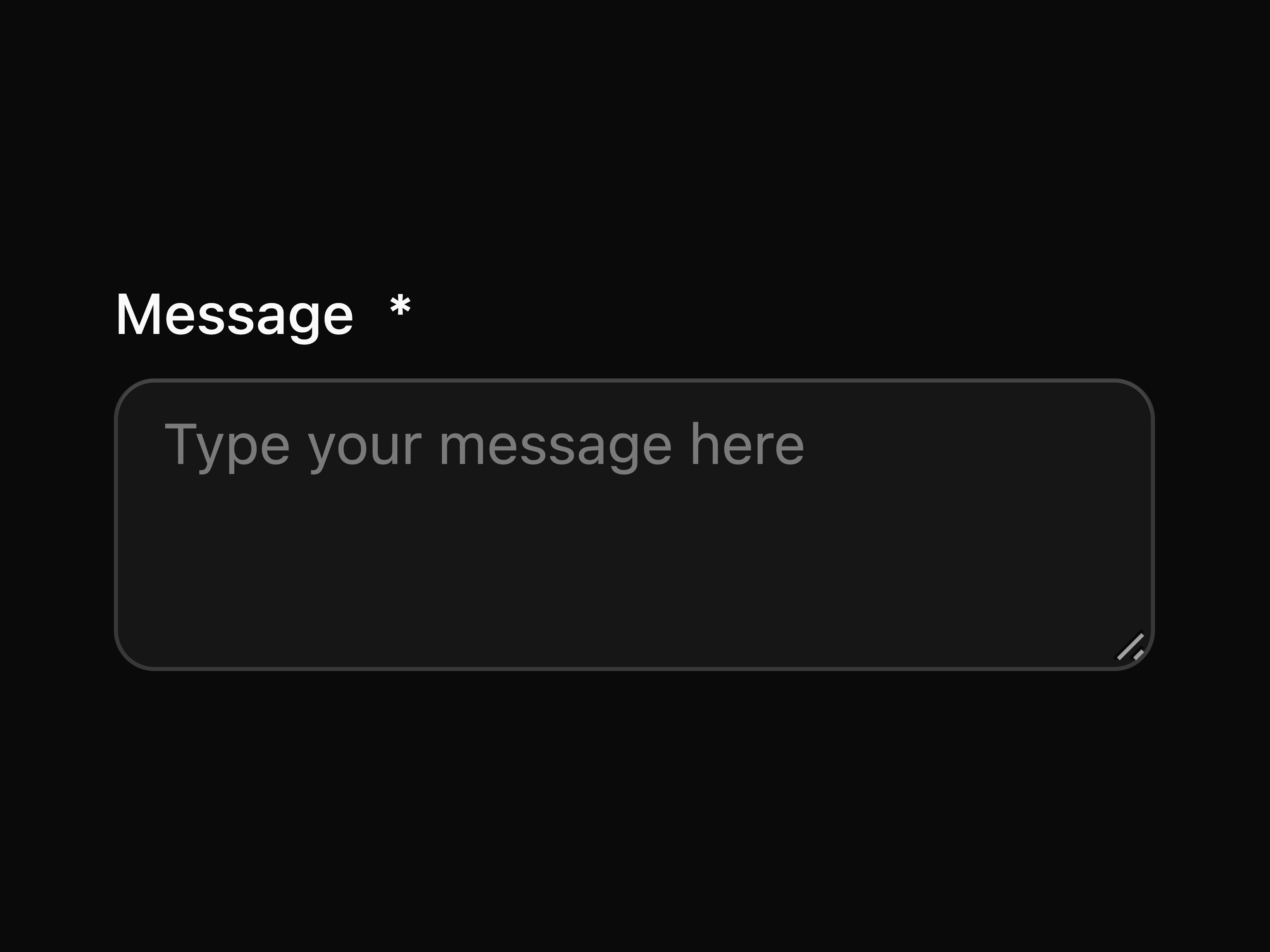
Field with textarea
block
npx shadcn@latest add @coss/p-field-10 registry/default/particles/p-field-11.tsx
p-field-11
Field with select
block
npx shadcn@latest add @coss/p-field-11 registry/default/particles/p-field-12.tsx
p-field-12
Field with checkbox
block
npx shadcn@latest add @coss/p-field-12 registry/default/particles/p-field-13.tsx
p-field-13
Field with checkbox group
block
npx shadcn@latest add @coss/p-field-13 registry/default/particles/p-field-14.tsx
p-field-14
Field with radio group
block
npx shadcn@latest add @coss/p-field-14 registry/default/particles/p-field-15.tsx
p-field-15
Field with toggle switch
block
npx shadcn@latest add @coss/p-field-15 registry/default/particles/p-field-16.tsx
p-field-16
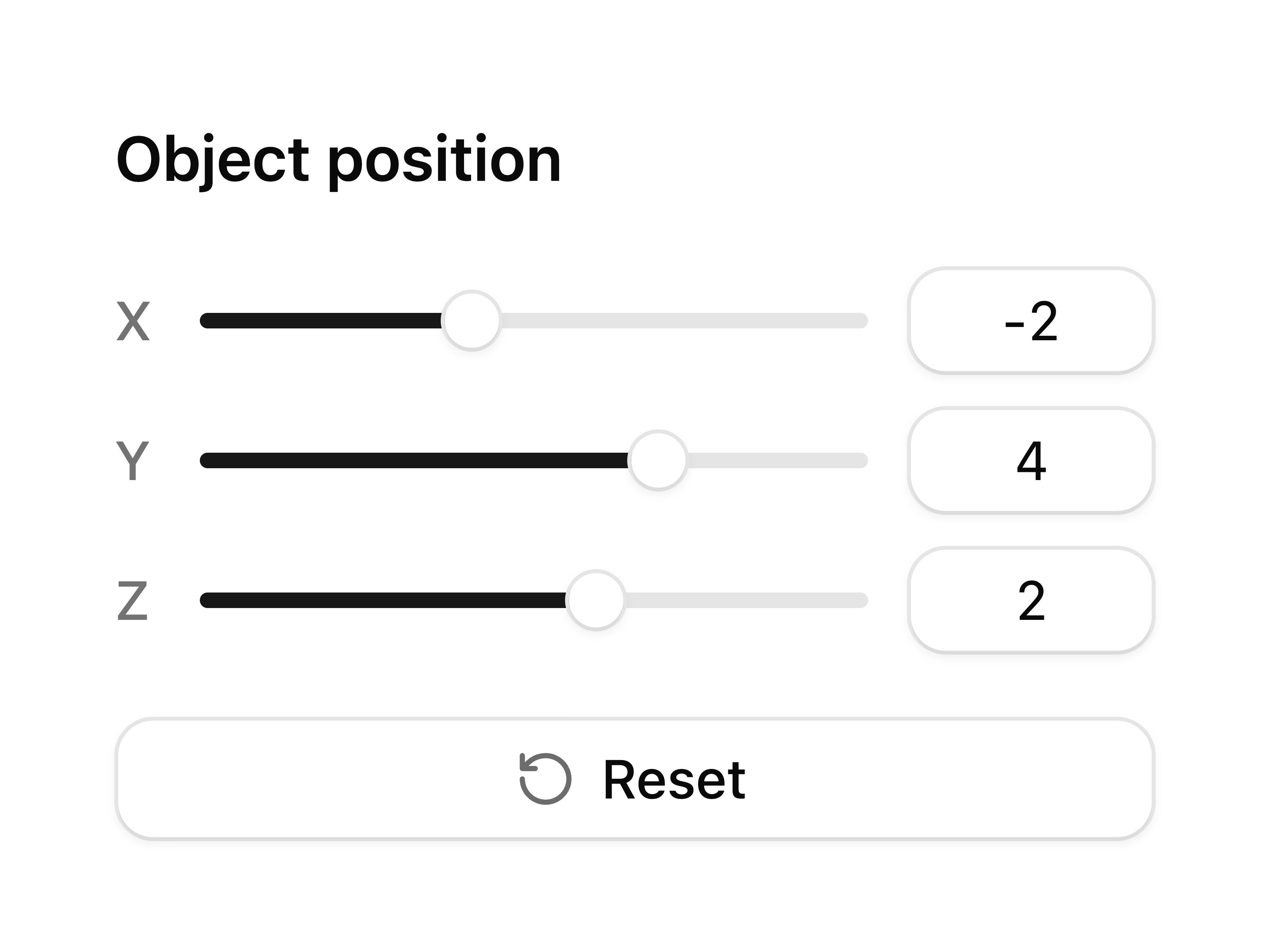
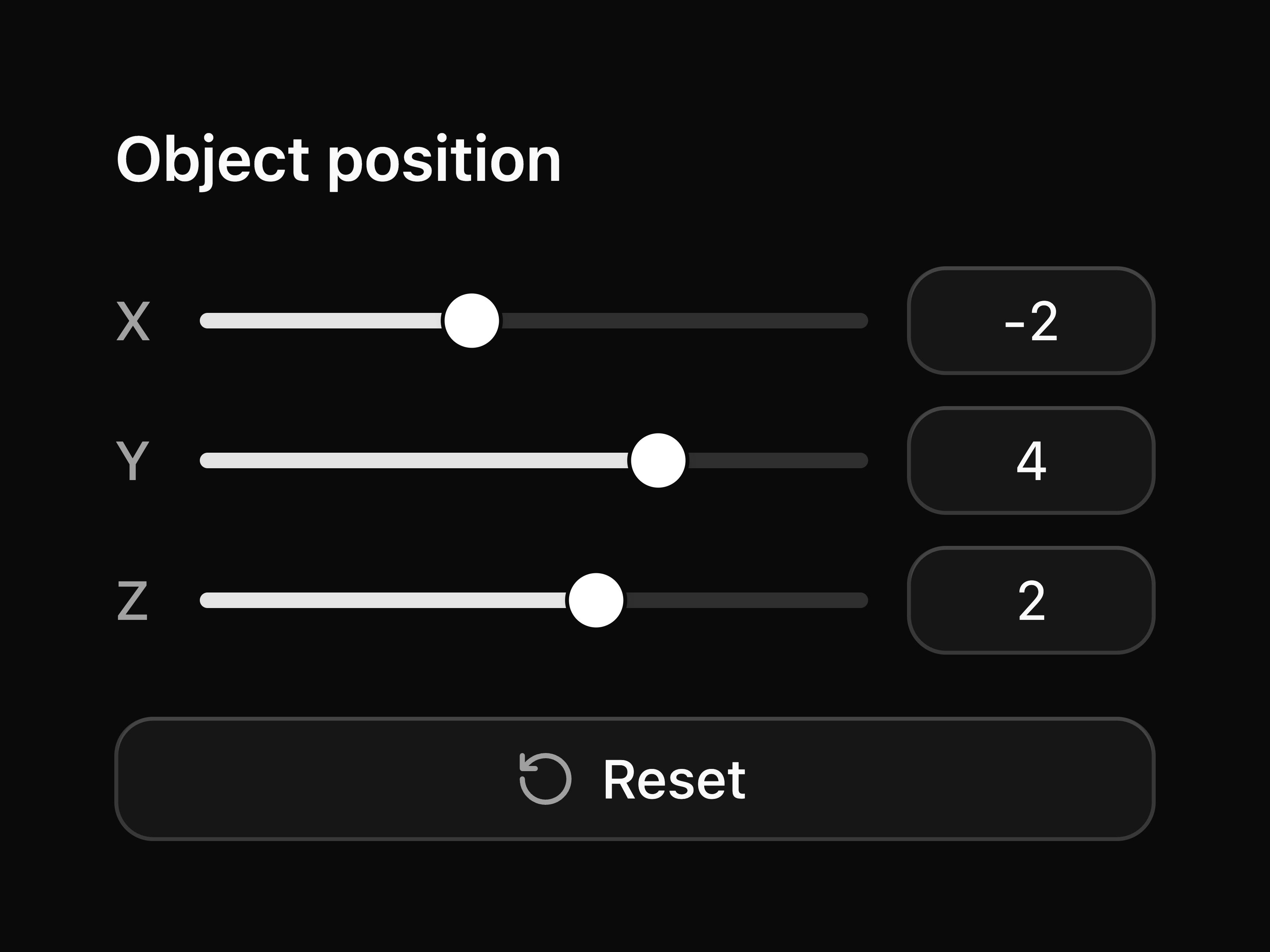
Field with slider
block
npx shadcn@latest add @coss/p-field-16 registry/default/particles/p-field-17.tsx
p-field-17
Field with number field
block
npx shadcn@latest add @coss/p-field-17 registry/default/particles/p-field-18.tsx
p-field-18
Complete form built with field
block
npx shadcn@latest add @coss/p-field-18 registry/default/particles/p-field-2.tsx
p-field-2
Field with required indicator
block
npx shadcn@latest add @coss/p-field-2 registry/default/particles/p-field-3.tsx
p-field-3
Field in disabled state
block
npx shadcn@latest add @coss/p-field-3 registry/default/particles/p-field-4.tsx
p-field-4
Field showing validation error
block
npx shadcn@latest add @coss/p-field-4 registry/default/particles/p-field-5.tsx
p-field-5
Show field validity state
block
npx shadcn@latest add @coss/p-field-5 registry/default/particles/p-field-6.tsx
p-field-6
Input group with field
block
npx shadcn@latest add @coss/p-field-6 registry/default/particles/p-field-7.tsx
p-field-7
Field with autocomplete
block
npx shadcn@latest add @coss/p-field-7 registry/default/particles/p-field-8.tsx
p-field-8
Field with combobox
block
npx shadcn@latest add @coss/p-field-8 registry/default/particles/p-field-9.tsx
p-field-9
Field with multiple selection combobox
block
npx shadcn@latest add @coss/p-field-9 registry/default/particles/p-fieldset-1.tsx
p-fieldset-1
Fieldset with multiple fields
block
npx shadcn@latest add @coss/p-fieldset-1 registry/default/particles/p-form-1.tsx
p-form-1
Input in a form
block
npx shadcn@latest add @coss/p-form-1 registry/default/particles/p-form-2.tsx
p-form-2
Form with zod validation
block zod
npx shadcn@latest add @coss/p-form-2 registry/default/particles/p-frame-1.tsx
p-frame-1
Basic frame
block
npx shadcn@latest add @coss/p-frame-1 registry/default/particles/p-frame-2.tsx
p-frame-2
Frame with collapsible content and delete button
block lucide-react
npx shadcn@latest add @coss/p-frame-2 registry/default/particles/p-frame-3.tsx
p-frame-3
Frame with multiple separated panels
block
npx shadcn@latest add @coss/p-frame-3 registry/default/particles/p-frame-4.tsx
p-frame-4
Frame with multiple stacked panels
block
npx shadcn@latest add @coss/p-frame-4 registry/default/particles/p-group-1.tsx
p-group-1
Basic group
block
npx shadcn@latest add @coss/p-group-1 registry/default/particles/p-group-10.tsx
p-group-10
Nested groups
block
npx shadcn@latest add @coss/p-group-10 registry/default/particles/p-group-11.tsx
p-group-11
Group with popup
block
npx shadcn@latest add @coss/p-group-11 registry/default/particles/p-group-12.tsx
p-group-12
Group with input group
block
npx shadcn@latest add @coss/p-group-12 registry/default/particles/p-group-13.tsx
p-group-13
Group with menu
block
npx shadcn@latest add @coss/p-group-13 registry/default/particles/p-group-14.tsx
p-group-14
Group with select
block
npx shadcn@latest add @coss/p-group-14 registry/default/particles/p-group-15.tsx
p-group-15
Group with search
block
npx shadcn@latest add @coss/p-group-15 registry/default/particles/p-group-16.tsx
p-group-16
Group with add button and input
block lucide-react
npx shadcn@latest add @coss/p-group-16 registry/default/particles/p-group-17.tsx
p-group-17
Group with input and currency text
block
npx shadcn@latest add @coss/p-group-17 registry/default/particles/p-group-18.tsx
p-group-18
Group with select and input
block
npx shadcn@latest add @coss/p-group-18 registry/default/particles/p-group-19.tsx
p-group-19
Group with input and select
block
npx shadcn@latest add @coss/p-group-19 registry/default/particles/p-group-2.tsx
p-group-2
Group with input
block use-copy-to-clipboard
npx shadcn@latest add @coss/p-group-2 registry/default/particles/p-group-20.tsx
p-group-20
Group with input and text button
block
npx shadcn@latest add @coss/p-group-20 registry/default/particles/p-group-22.tsx
p-group-22
Group with two number inputs for range
block
npx shadcn@latest add @coss/p-group-22 registry/default/particles/p-group-23.tsx
p-group-23
Group with filter label, combobox multi-select, and remove button
block
npx shadcn@latest add @coss/p-group-23 registry/default/particles/p-group-3.tsx
p-group-3
Small group
block
npx shadcn@latest add @coss/p-group-3 registry/default/particles/p-group-4.tsx
p-group-4
Large group
block
npx shadcn@latest add @coss/p-group-4 registry/default/particles/p-group-5.tsx
p-group-5
Group with disabled button
block
npx shadcn@latest add @coss/p-group-5 registry/default/particles/p-group-6.tsx
p-group-6
Group with default button
block
npx shadcn@latest add @coss/p-group-6 registry/default/particles/p-group-7.tsx
p-group-7
Group with start text
block
npx shadcn@latest add @coss/p-group-7 registry/default/particles/p-group-8.tsx
p-group-8
Group with end text
block
npx shadcn@latest add @coss/p-group-8 registry/default/particles/p-group-9.tsx
p-group-9
Vertical group
block
npx shadcn@latest add @coss/p-group-9 registry/default/particles/p-input-1.tsx
p-input-1
Basic input
block
npx shadcn@latest add @coss/p-input-1 registry/default/particles/p-input-10.tsx
p-input-10
Input group mimicking a URL bar
block
npx shadcn@latest add @coss/p-input-10 registry/default/particles/p-input-11.tsx
p-input-11
Input group with keyboard shortcut
block
npx shadcn@latest add @coss/p-input-11 registry/default/particles/p-input-12.tsx
p-input-12
Input group with start loading spinner
block spinner
npx shadcn@latest add @coss/p-input-12 registry/default/particles/p-input-13.tsx
p-input-13
Input with label and required indicator
block
npx shadcn@latest add @coss/p-input-13 registry/default/particles/p-input-14.tsx
p-input-14
Input with optional label
block
npx shadcn@latest add @coss/p-input-14 registry/default/particles/p-input-15.tsx
p-input-15
Input with custom border and background
block
npx shadcn@latest add @coss/p-input-15 registry/default/particles/p-input-16.tsx
p-input-16
Input group with end loading spinner
block spinner
npx shadcn@latest add @coss/p-input-16 registry/default/particles/p-input-17.tsx
p-input-17
Read-only input
block
npx shadcn@latest add @coss/p-input-17 registry/default/particles/p-input-18.tsx
p-input-18
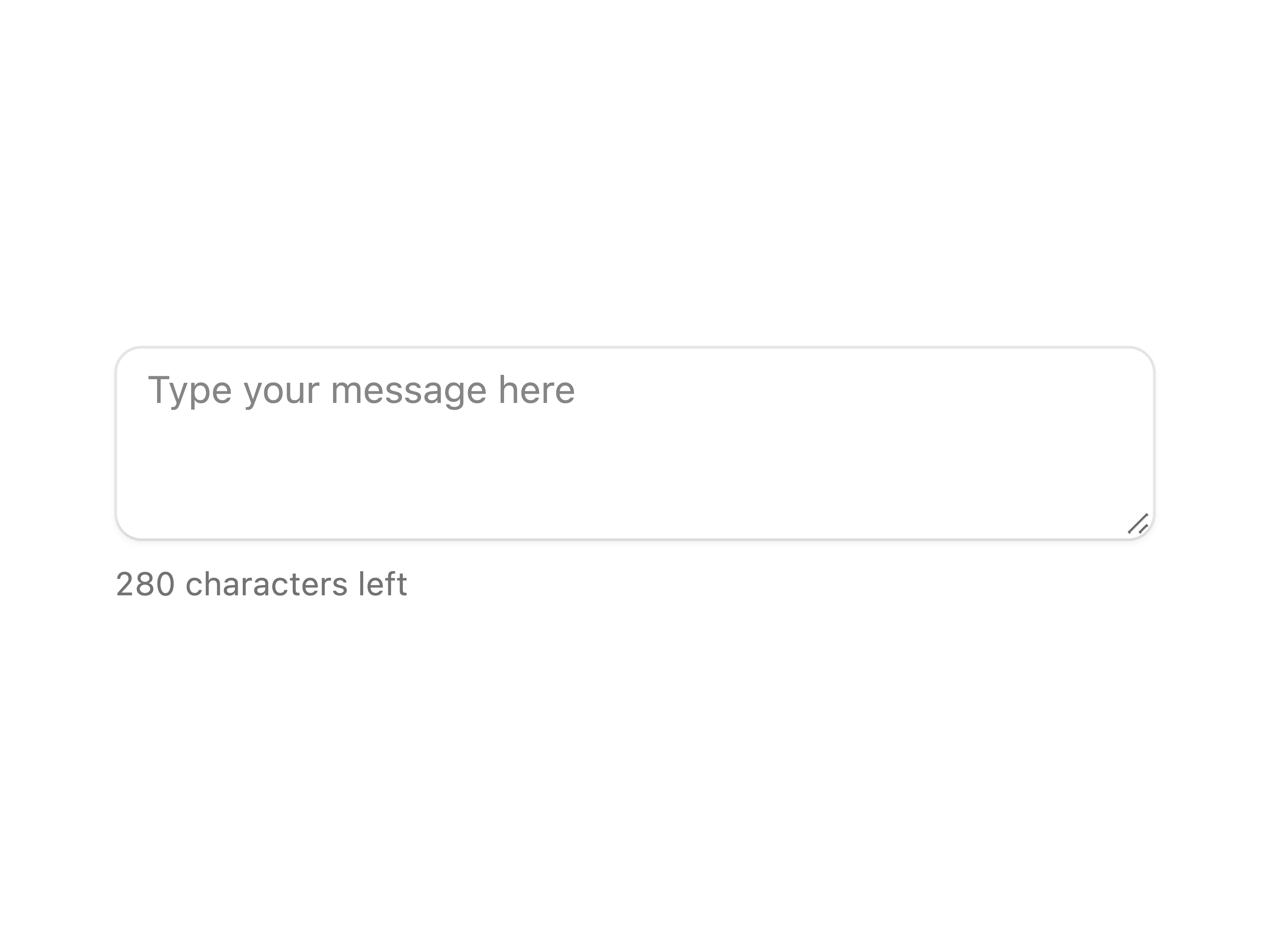
Input with characters remaining counter
block
npx shadcn@latest add @coss/p-input-18 registry/default/particles/p-input-19.tsx
p-input-19
Pill-shaped input
block
npx shadcn@latest add @coss/p-input-19 registry/default/particles/p-input-2.tsx
p-input-2
Small input
block
npx shadcn@latest add @coss/p-input-2 registry/default/particles/p-input-3.tsx
p-input-3
Large input
block
npx shadcn@latest add @coss/p-input-3 registry/default/particles/p-input-4.tsx
p-input-4
Disabled input
block
npx shadcn@latest add @coss/p-input-4 registry/default/particles/p-input-5.tsx
p-input-5
File input
block
npx shadcn@latest add @coss/p-input-5 registry/default/particles/p-input-6.tsx
p-input-6
Input with label
block
npx shadcn@latest add @coss/p-input-6 registry/default/particles/p-input-7.tsx
p-input-7
Input with button using Group
block
npx shadcn@latest add @coss/p-input-7 registry/default/particles/p-input-8.tsx
p-input-8
Input with start text and end tooltip
block
npx shadcn@latest add @coss/p-input-8 registry/default/particles/p-input-9.tsx
p-input-9
Password input with toggle visibility
block
npx shadcn@latest add @coss/p-input-9 registry/default/particles/p-input-group-1.tsx
p-input-group-1
Basic input group
block
npx shadcn@latest add @coss/p-input-group-1 registry/default/particles/p-input-group-10.tsx
p-input-group-10
Input group with badge
block
npx shadcn@latest add @coss/p-input-group-10 registry/default/particles/p-input-group-11.tsx
p-input-group-11
Input group with keyboard shortcut
block
npx shadcn@latest add @coss/p-input-group-11 registry/default/particles/p-input-group-12.tsx
p-input-group-12
Input group with inner label
block
npx shadcn@latest add @coss/p-input-group-12 registry/default/particles/p-input-group-13.tsx
p-input-group-13
Small input group
block
npx shadcn@latest add @coss/p-input-group-13 registry/default/particles/p-input-group-14.tsx
p-input-group-14
Large input group
block
npx shadcn@latest add @coss/p-input-group-14 registry/default/particles/p-input-group-15.tsx
p-input-group-15
Disabled input group
block
npx shadcn@latest add @coss/p-input-group-15 registry/default/particles/p-input-group-16.tsx
p-input-group-16
Input group with loading spinner
block spinner
npx shadcn@latest add @coss/p-input-group-16 registry/default/particles/p-input-group-17.tsx
p-input-group-17
Input group with textarea
block
npx shadcn@latest add @coss/p-input-group-17 registry/default/particles/p-input-group-18.tsx
p-input-group-18
Input group with badge and menu
block lucide-react
npx shadcn@latest add @coss/p-input-group-18 registry/default/particles/p-input-group-19.tsx
p-input-group-19
Mini editor built with input group and toggle
block lucide-react
npx shadcn@latest add @coss/p-input-group-19 registry/default/particles/p-input-group-2.tsx
p-input-group-2
Input group with end icon
block lucide-react
npx shadcn@latest add @coss/p-input-group-2 registry/default/particles/p-input-group-20.tsx
p-input-group-20
Input group with search icon
block lucide-react
npx shadcn@latest add @coss/p-input-group-20 registry/default/particles/p-input-group-21.tsx
p-input-group-21
Input group with start tooltip
block lucide-react
npx shadcn@latest add @coss/p-input-group-21 registry/default/particles/p-input-group-22.tsx
p-input-group-22
Input group with clear button
block lucide-react
npx shadcn@latest add @coss/p-input-group-22 registry/default/particles/p-input-group-23.tsx
p-input-group-23
Search input group with loader and voice button
block lucide-react
npx shadcn@latest add @coss/p-input-group-23 registry/default/particles/p-input-group-24.tsx
p-input-group-24
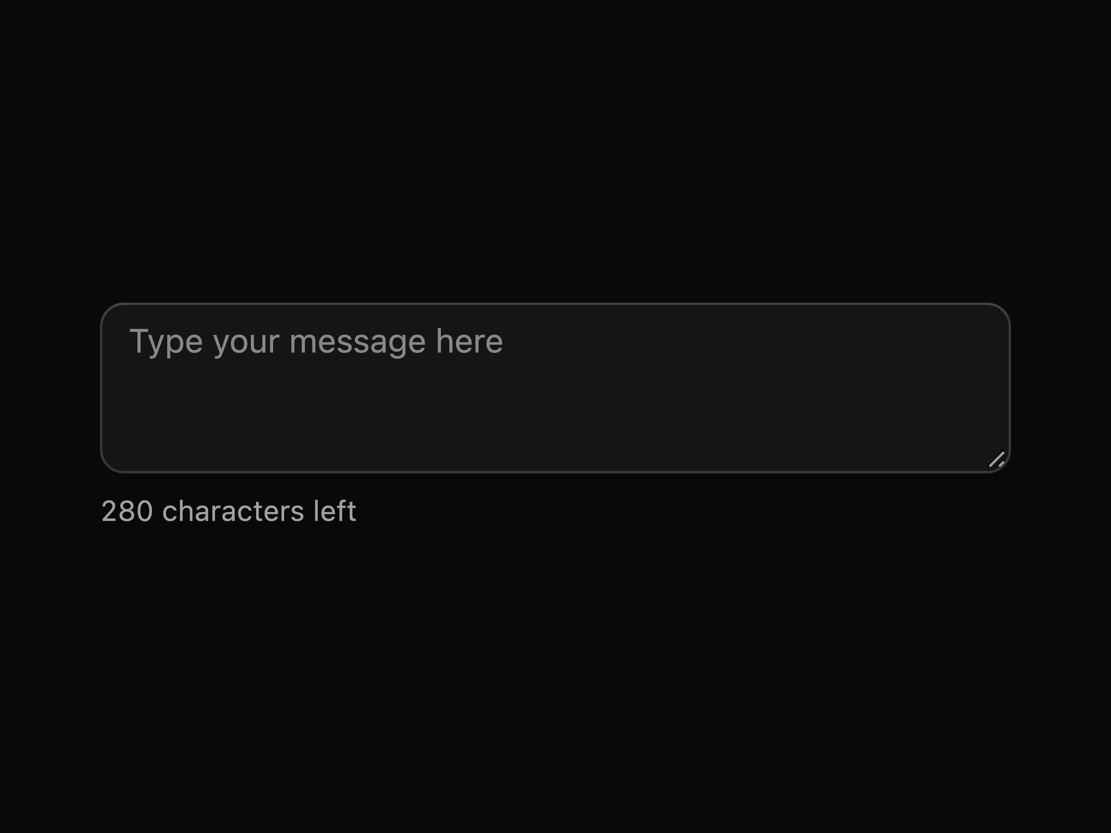
Input group with character counter
block
npx shadcn@latest add @coss/p-input-group-24 registry/default/particles/p-input-group-26.tsx
p-input-group-26
Password input with strength indicator
block lucide-react
npx shadcn@latest add @coss/p-input-group-26 registry/default/particles/p-input-group-27.tsx
p-input-group-27
Code snippet input with language selector
block lucide-react
npx shadcn@latest add @coss/p-input-group-27 registry/default/particles/p-input-group-28.tsx
p-input-group-28
Message composer with attachment buttons
block lucide-react
npx shadcn@latest add @coss/p-input-group-28 registry/default/particles/p-input-group-29.tsx
p-input-group-29
Chat input with voice and send buttons
block lucide-react
npx shadcn@latest add @coss/p-input-group-29 registry/default/particles/p-input-group-3.tsx
p-input-group-3
Input group with start text
block
npx shadcn@latest add @coss/p-input-group-3 registry/default/particles/p-input-group-4.tsx
p-input-group-4
Input group with end text
block
npx shadcn@latest add @coss/p-input-group-4 registry/default/particles/p-input-group-5.tsx
p-input-group-5
Input group with start and end text
block
npx shadcn@latest add @coss/p-input-group-5 registry/default/particles/p-input-group-6.tsx
p-input-group-6
Input group with number field
block
npx shadcn@latest add @coss/p-input-group-6 registry/default/particles/p-input-group-7.tsx
p-input-group-7
Input group with end tooltip
block lucide-react
npx shadcn@latest add @coss/p-input-group-7 registry/default/particles/p-input-group-8.tsx
p-input-group-8
Input group with icon button
block lucide-react
npx shadcn@latest add @coss/p-input-group-8 registry/default/particles/p-input-group-9.tsx
p-input-group-9
Input group with button
block
npx shadcn@latest add @coss/p-input-group-9 registry/default/particles/p-kbd-1.tsx
p-kbd-1
Keyboard shortcuts display
block
npx shadcn@latest add @coss/p-kbd-1 registry/default/particles/p-menu-1.tsx
p-menu-1
Basic menu
block
npx shadcn@latest add @coss/p-menu-1 registry/default/particles/p-menu-2.tsx
p-menu-2
Menu with hover
block
npx shadcn@latest add @coss/p-menu-2 registry/default/particles/p-menu-3.tsx
p-menu-3
Menu with checkbox
block
npx shadcn@latest add @coss/p-menu-3 registry/default/particles/p-menu-4.tsx
p-menu-4
Menu with radio group
block
npx shadcn@latest add @coss/p-menu-4 registry/default/particles/p-menu-5.tsx
p-menu-5
Menu with link
block
npx shadcn@latest add @coss/p-menu-5 registry/default/particles/p-menu-6.tsx
p-menu-6
Menu with group labels
block
npx shadcn@latest add @coss/p-menu-6 registry/default/particles/p-menu-7.tsx
p-menu-7
Nested menu
block
npx shadcn@latest add @coss/p-menu-7 registry/default/particles/p-menu-8.tsx
p-menu-8
Menu close on click
block
npx shadcn@latest add @coss/p-menu-8 registry/default/particles/p-menu-9.tsx
p-menu-9
Menu with checkbox items as switches
block
npx shadcn@latest add @coss/p-menu-9 registry/default/particles/p-meter-1.tsx
p-meter-1
Basic meter
block
npx shadcn@latest add @coss/p-meter-1 registry/default/particles/p-meter-2.tsx
p-meter-2
Simple meter
block
npx shadcn@latest add @coss/p-meter-2 registry/default/particles/p-meter-3.tsx
p-meter-3
Meter with formatted value
block
npx shadcn@latest add @coss/p-meter-3 registry/default/particles/p-meter-4.tsx
p-meter-4
Meter with range
block
npx shadcn@latest add @coss/p-meter-4 registry/default/particles/p-navigation-1.tsx
p-navigation-1
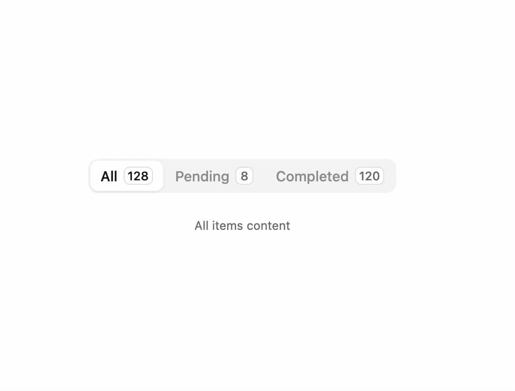
Segmented navigation built with links
block segmented-control
npx shadcn@latest add @coss/p-navigation-1 registry/default/particles/p-navigation-2.tsx
p-navigation-2
Small segmented navigation built with links
block segmented-control
npx shadcn@latest add @coss/p-navigation-2 registry/default/particles/p-navigation-3.tsx
p-navigation-3
Large segmented navigation built with links
block segmented-control
npx shadcn@latest add @coss/p-navigation-3 registry/default/particles/p-number-field-1.tsx
p-number-field-1
Basic number field
block
npx shadcn@latest add @coss/p-number-field-1 registry/default/particles/p-number-field-10.tsx
p-number-field-10
Number field in form
block zod
npx shadcn@latest add @coss/p-number-field-10 registry/default/particles/p-number-field-11.tsx
p-number-field-11
Pill-shaped number field
block
npx shadcn@latest add @coss/p-number-field-11 registry/default/particles/p-number-field-2.tsx
p-number-field-2
Small number field
block
npx shadcn@latest add @coss/p-number-field-2 registry/default/particles/p-number-field-3.tsx
p-number-field-3
Large number field
block
npx shadcn@latest add @coss/p-number-field-3 registry/default/particles/p-number-field-4.tsx
p-number-field-4
Disabled number field
block
npx shadcn@latest add @coss/p-number-field-4 registry/default/particles/p-number-field-5.tsx
p-number-field-5
Number field with label
block
npx shadcn@latest add @coss/p-number-field-5 registry/default/particles/p-number-field-6.tsx
p-number-field-6
Number field with scrub
block
npx shadcn@latest add @coss/p-number-field-6 registry/default/particles/p-number-field-7.tsx
p-number-field-7
Number field with range
block
npx shadcn@latest add @coss/p-number-field-7 registry/default/particles/p-number-field-8.tsx
p-number-field-8
Number field with formatted value
block
npx shadcn@latest add @coss/p-number-field-8 registry/default/particles/p-number-field-9.tsx
p-number-field-9
Number field with step
block
npx shadcn@latest add @coss/p-number-field-9 registry/default/particles/p-otp-field-1.tsx
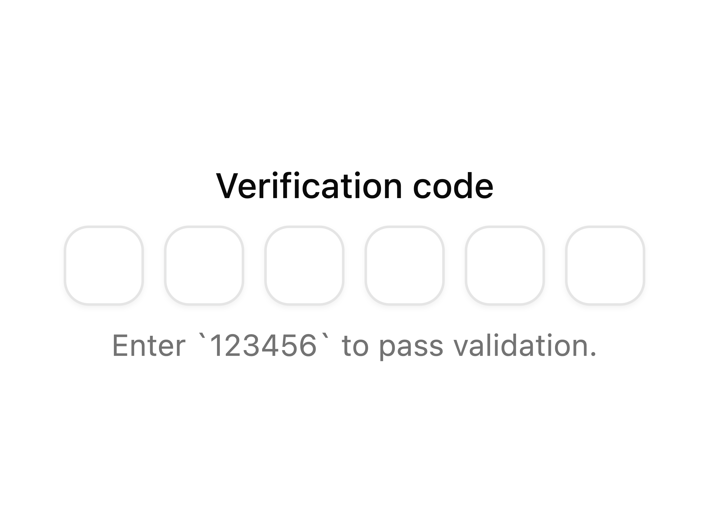
p-otp-field-1
Basic OTP field
block
npx shadcn@latest add @coss/p-otp-field-1 registry/default/particles/p-otp-field-10.tsx
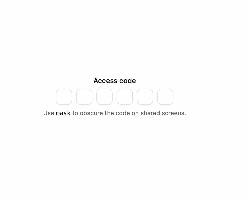
p-otp-field-10
Masked OTP field
block
npx shadcn@latest add @coss/p-otp-field-10 registry/default/particles/p-otp-field-2.tsx
p-otp-field-2
Large OTP field
block
npx shadcn@latest add @coss/p-otp-field-2 registry/default/particles/p-otp-field-3.tsx
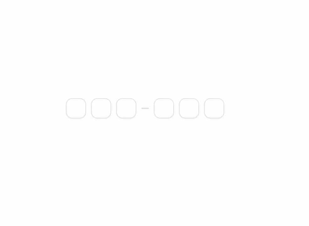
p-otp-field-3
OTP field with separator
block
npx shadcn@latest add @coss/p-otp-field-3 registry/default/particles/p-otp-field-4.tsx
p-otp-field-4
OTP field with label
block
npx shadcn@latest add @coss/p-otp-field-4 registry/default/particles/p-otp-field-6.tsx
p-otp-field-6
OTP field with custom sanitization
block
npx shadcn@latest add @coss/p-otp-field-6 registry/default/particles/p-otp-field-7.tsx
p-otp-field-7
OTP field with auto validation
block
npx shadcn@latest add @coss/p-otp-field-7 registry/default/particles/p-otp-field-8.tsx
p-otp-field-8
Alphanumeric OTP field
block
npx shadcn@latest add @coss/p-otp-field-8 registry/default/particles/p-otp-field-9.tsx
p-otp-field-9
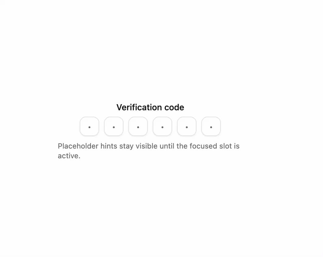
OTP field with placeholder hints
block
npx shadcn@latest add @coss/p-otp-field-9