Pace UI
React component library on Tailwind and shadcn/ui with 50+ component variants, 100+ blocks, and starter kits.
12components319.3Kviews2Kbookmarks
Installs all 28 components. Without our CLI, run instead.
Auto-indexed
Pace UI contents
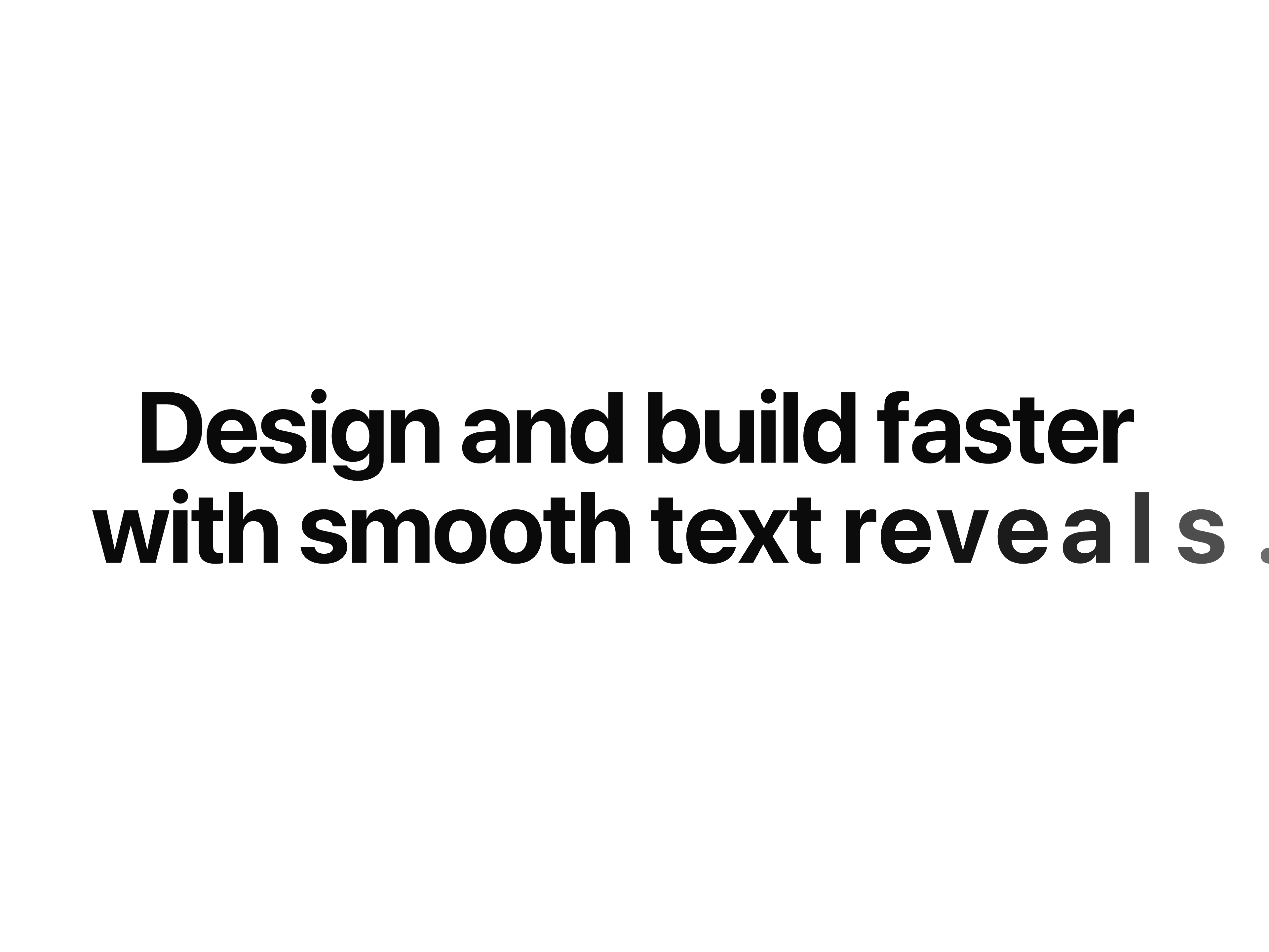
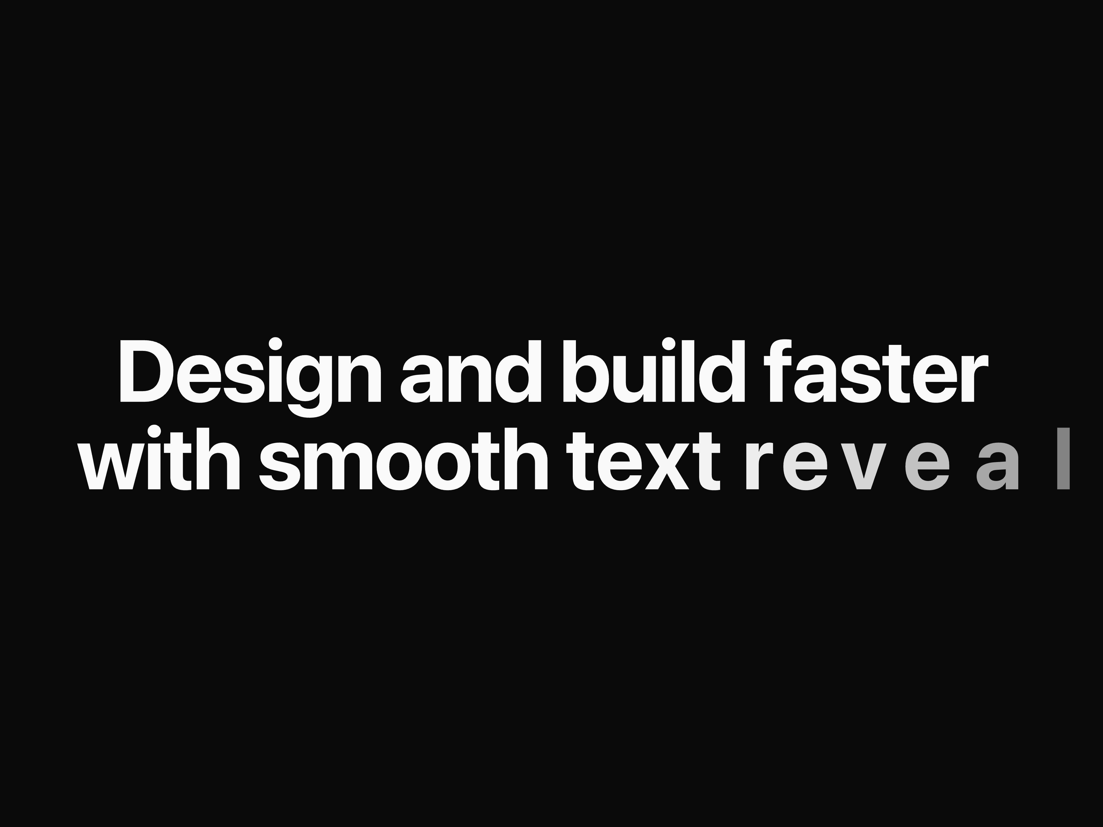
Reveal Text


Spring Button

Text Fall Button

Layered Stack

Form Textarea

Form Switch

Dot Flow

Liquid Glass

Liquid Cursor

Flip Reveal

Draw Line Text

Dot Loader
That's all 12 components
About Pace UI
Pace UI publishes a shadcn registry at gsap.paceui.com, with 28 components installable through the shadcn CLI.
- Components
- 28
- GitHub stars
- 15
- Last commit
- Jul 31, 2026
- Repository
- paceui/community
Also in the Pace UI registry
Copy a prompt for your agent, copy the install command, or open the docs that ship it.
Modal Ability Selector
ai-modal-ability-selectorCompact selector for toggling abilities with icons and custom styles
gsap, @gsap/react1 fileModal Selector
ai-modal-selectorAI-focused model selector with preview, tooltips, and capability indicators built-in
gsap, @gsap/react1 fileResponse Writer
ai-response-writerAn auto-scrolling text display that smoothly keeps the latest response always visible
gsap, @gsap/react2 filesAI Suggestions
ai-suggestionsGet smart, real-time AI recommendations to refine and improve your work
gsap, @gsap/react1 fileModal Ability Selector
ai-token-counterCompact selector for toggling abilities with icons and custom styles
gsap, @gsap/react1 fileAnimated Stack
animated-stackA smooth stacked card component that expands on hover and collapses with animation.
gsap, @gsap/react1 fileBouncing Text
bouncing-textA playful animation where characters bounce in sequence across the text.
gsap, @gsap/react1 fileFillable Button
fillable-buttonA button that fills with color on hover.
gsap, @gsap/react1 fileGitHub Star Counter
github-star-counterDisplay live GitHub star count for any public repository
rolling-number1 fileGradient Shadow
gradient-shadowSmooth horizontal gradient flow, creating a subtle glowing hover shadow effect.
gsap, @gsap/react1 fileMouse Wave Text
mouse-wave-textCreates a wave-like bounce effect on text as the mouse moves across
gsap, @gsap/react1 fileProfile Peek
profile-peekHover to peek profile with smooth reveal, right from the image.
gsap, @gsap/react1 fileReveal On Scroll
reveal-on-scrollAnimate content into view on scroll with effects like fade, slide, zoom, and blur.
gsap, @gsap/react1 fileScramble Text
scramble-textA hover-triggered text effect that scrambles and restores characters with smooth motion
gsap, @gsap/react1 fileSquash Text
squash-textCharacters bounce and squash into place with playful, dynamic energy.
gsap, @gsap/react1 fileStagger on Scroll
stagger-on-scrollStagger elements into view with scroll-triggered fade, slide, zoom, or blur effects.
gsap, @gsap/react1 fileSwap
A flexible swap component that animates content changes with smooth customizable transition effects.
gsap, @gsap/react1 fileTilt Card
tilt-cardInteractive 3D tilt card that responds to cursor, adds depth and motion
gsap, @gsap/react1 file