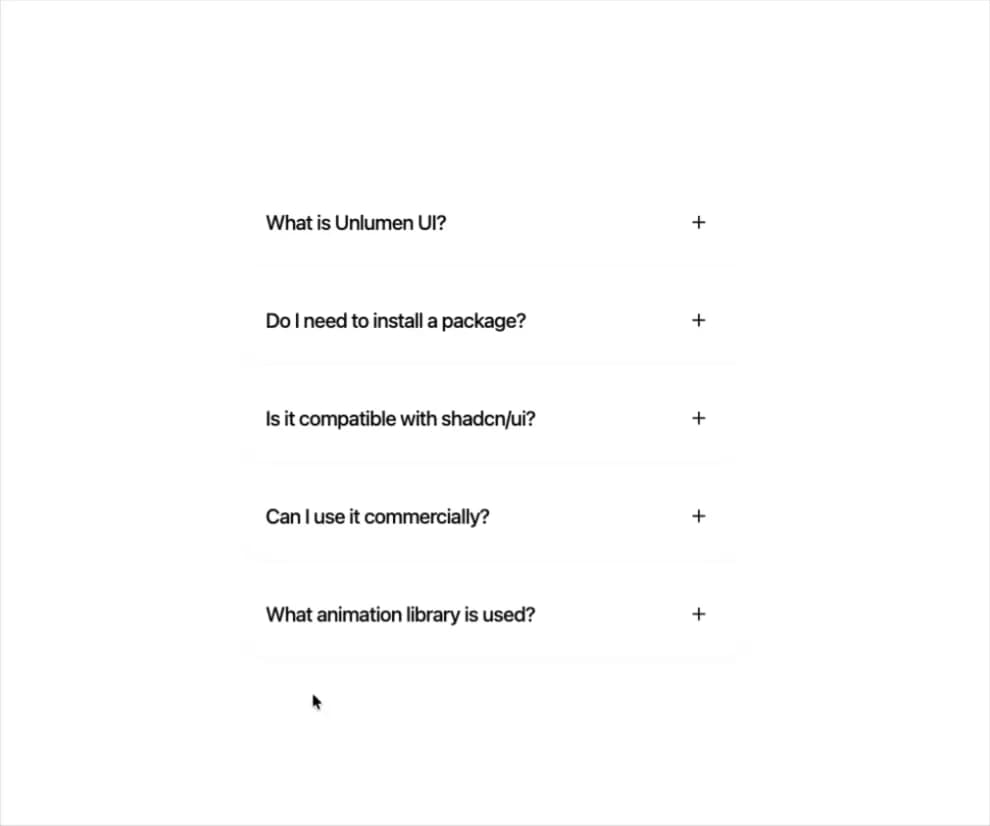
"use client";

import {
  MotionAccordion,
  type MotionAccordionProps,
} from "@/components/ui/unlumen-motion-faqs-accordion";

const ITEMS = [
  {
    question: "What is Unlumen UI?",
    answer:
      "Unlumen UI is a collection of premium, open-source components built with Motion and Tailwind CSS. Each component is designed to be copy-pasteable, fully typed, and production-ready.",
  },
  {
    question: "Do I need to install a package?",
    answer:
      "No. Every component is delivered as source code via the registry. You copy what you need — no runtime dependency, no black-box abstractions.",
  },
  {
    question: "Is it compatible with shadcn/ui?",
    answer:
      "Yes. Unlumen UI components sit alongside shadcn/ui primitives. They share the same Tailwind CSS variables and can be mixed freely in any project.",
  },
  {
    question: "Can I use it commercially?",
    answer:
      "Free components are MIT-licensed. Premium components require an active license. See the pricing page for details.",
  },
  {
    question: "What animation library is used?",
    answer:
      "All animations use Motion (formerly Framer Motion). Springs, layout animations, and gesture handling are first-class — no CSS keyframes required.",
  },
];

type MotionAccordionDemoProps = Pick<MotionAccordionProps, "gap">;

const MotionAccordionDemo = ({ gap = 10 }: MotionAccordionDemoProps) => {
  return (
    <div className="w-full max-w-xl mx-auto px-4">
      <MotionAccordion items={ITEMS} gap={gap} />
    </div>
  );
};


export { MotionAccordionDemo };

export default function DefaultDemo() { return <MotionAccordionDemo />; }