'use client'

import { useState } from 'react'
import type { CSSProperties } from 'react'
import FrameCard from '@/components/ui/frame-card'

const settings = {
  title: 'Signal Studio',
  accent: '#2455e6',
  duration: 0.32,
  motion: true,
}

// Embedded vector artwork keeps the demo independent of private assets and image hosts.
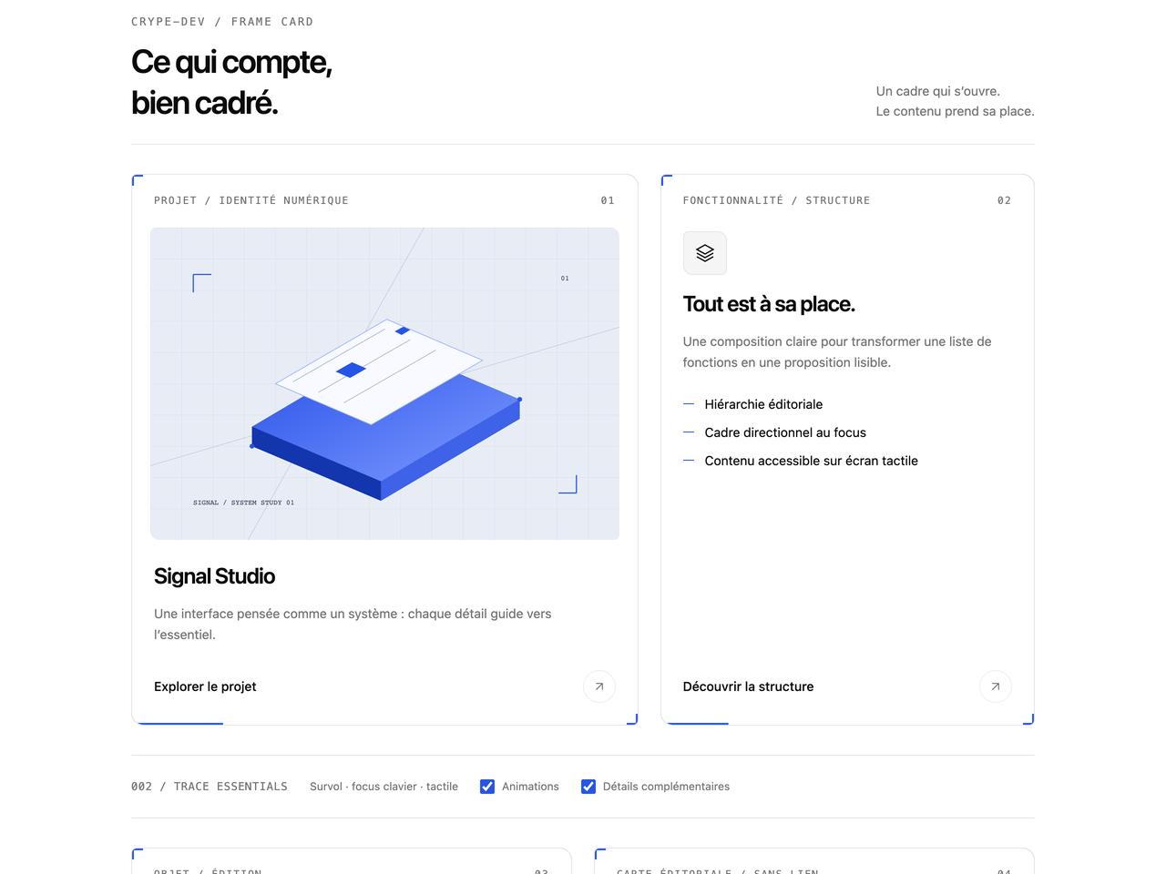
const signalImage = `data:image/svg+xml,${encodeURIComponent(`<svg xmlns="http://www.w3.org/2000/svg" width="1200" height="800" viewBox="0 0 1200 800"><defs><pattern id="grid" width="80" height="80" patternUnits="userSpaceOnUse"><path d="M80 0H0V80" fill="none" stroke="#cbd5e1" stroke-width="1"/></pattern><linearGradient id="plane" x1="0" y1="0" x2="1" y2="1"><stop stop-color="#244ee8"/><stop offset="1" stop-color="#7f9bff"/></linearGradient></defs><rect width="1200" height="800" fill="#e8edf5"/><rect width="1200" height="800" fill="url(#grid)"/><path d="M0 610 1200 255M250 800 700 0" stroke="#adb8cc" fill="none"/><path d="m260 560 355-210 330 140-355 210Z" fill="#111b30"/><path d="m260 510 355-210 330 140-355 210Z" fill="url(#plane)"/><path d="m260 510 330 140v50l-330-140Z" fill="#1335ad"/><path d="m590 650 355-210v50L590 700Z" fill="#3e62e8"/><path d="m320 400 285-165 245 105-285 165Z" fill="#f8faff" stroke="#9bb3ff" stroke-width="2"/><path d="m365 395 235-135M430 422 665 287M495 449 730 314" stroke="#aab9d6" stroke-width="2"/><path d="m474 369 42-24 37 16-42 24Z" fill="#2455e6"/><path d="m625 266 22-12 18 8-22 13Z" fill="#2455e6"/><circle cx="260" cy="560" r="6" fill="#2455e6"/><circle cx="945" cy="440" r="6" fill="#2455e6"/><path d="M110 120h46m-46 0v46M1090 680h-46m46 0v-46" stroke="#2455e6" stroke-width="3" fill="none"/><text x="110" y="710" font-family="monospace" font-size="18" fill="#334155">SIGNAL / SYSTEM STUDY 01</text><text x="1050" y="135" font-family="monospace" font-size="18" fill="#334155">01</text></svg>`)}`
const objectImage = `data:image/svg+xml,${encodeURIComponent(`<svg xmlns="http://www.w3.org/2000/svg" width="1200" height="800" viewBox="0 0 1200 800"><defs><pattern id="lines" width="36" height="36" patternUnits="userSpaceOnUse"><path d="M0 36 36 0" stroke="#28334a" stroke-width="1"/></pattern></defs><rect width="1200" height="800" fill="#101828"/><rect width="1200" height="800" fill="url(#lines)"/><ellipse cx="610" cy="650" rx="250" ry="35" fill="#050b18"/><path d="m440 300 170-100 190 110v220L610 640 440 540Z" fill="#243555" stroke="#7286a9" stroke-width="2"/><path d="m440 300 170 100 190-90-190-110Z" fill="#e9eef8"/><path d="m610 400 190-90v220L610 640Z" fill="#2455e6"/><path d="M610 430v160m25-175v158m25-170v153m25-166v150m25-162v147m25-158v144m25-155v140" stroke="#89a5ff" stroke-width="2"/><path d="M150 130h48m-48 0v48M1050 670h-48m48 0v-48" stroke="#89a5ff" fill="none" stroke-width="3"/><text x="150" y="700" font-family="monospace" font-size="18" fill="#c7d2e8">OBJECT / VOLUME STUDY 02</text></svg>`)}`

export default function FrameCardDemo(props: Partial<typeof settings>) {
  const options = { ...settings, ...props }
  const [motion, setMotion] = useState(true)
  const [details, setDetails] = useState(true)
  const [mounted, setMounted] = useState(true)
  const [brokenImage, setBrokenImage] = useState(false)
  const animation = {
    motion: options.motion && motion,
    duration: options.duration,
  }

  return (
    <div
      data-frame-demo
      className="mx-auto w-full max-w-5xl space-y-8 px-2 py-4 sm:px-4"
      style={
        {
          '--primary': options.accent,
          '--primary-foreground': '#ffffff',
        } as CSSProperties
      }
    >
      <header className="flex flex-wrap items-end justify-between gap-5 border-b border-border pb-6">
        <div>
          <p className="mb-3 font-mono text-xs tracking-[0.16em] text-muted-foreground">
            CRYPE-DEV / FRAME CARD
          </p>
          <h2 className="text-3xl leading-tight font-semibold tracking-[-0.045em] sm:text-4xl">
            Ce qui compte,
            <br />
            bien cadré.
          </h2>
        </div>
        <p className="max-w-56 text-sm leading-relaxed text-muted-foreground">
          Un cadre qui s’ouvre.
          <br />
          Le contenu prend sa place.
        </p>
      </header>

      <div className="grid items-stretch gap-6 md:grid-cols-[1.15fr_0.85fr]">
        <FrameCard
          id="frame-project"
          title={options.title}
          eyebrow="Projet / Identité numérique"
          index="01"
          description="Une interface pensée comme un système : chaque détail guide vers l’essentiel."
          image={{
            src: brokenImage ? 'data:image/png;base64,broken' : signalImage,
            alt: 'Étude graphique de plans superposés et d’une grille architecturale',
            loading: 'eager',
          }}
          href="#frame-destination"
          actionLabel="Explorer le projet"
          {...animation}
        />
        <FrameCard
          id="frame-feature"
          title="Tout est à sa place."
          eyebrow="Fonctionnalité / Structure"
          index="02"
          description="Une composition claire pour transformer une liste de fonctions en une proposition lisible."
          icon={
            <svg
              viewBox="0 0 24 24"
              fill="none"
              stroke="currentColor"
              strokeWidth="1.4"
            >
              <path d="m12 3 9 5-9 5-9-5Z" />
              <path d="m3 12 9 5 9-5M3 16l9 5 9-5" />
            </svg>
          }
          details={
            details
              ? [
                  'Hiérarchie éditoriale',
                  'Cadre directionnel au focus',
                  'Contenu accessible sur écran tactile',
                ]
              : undefined
          }
          href="#frame-destination"
          actionLabel="Découvrir la structure"
          {...animation}
        />
      </div>

      <div className="flex flex-wrap items-center gap-x-6 gap-y-2 border-y border-border py-3 text-xs text-muted-foreground">
        <span className="font-mono tracking-wider">002 / TRACE ESSENTIALS</span>
        <span>Survol · focus clavier · tactile</span>
        <label className="flex min-h-11 cursor-pointer items-center gap-2">
          <input
            type="checkbox"
            checked={motion}
            onChange={(event) => setMotion(event.target.checked)}
            className="size-4 accent-primary"
          />
          Animations
        </label>
        <label className="flex min-h-11 cursor-pointer items-center gap-2">
          <input
            id="frame-details"
            type="checkbox"
            checked={details}
            onChange={(event) => setDetails(event.target.checked)}
            className="size-4 accent-primary"
          />
          Détails complémentaires
        </label>
      </div>

      <section aria-label="Autres usages" className="grid gap-6 md:grid-cols-2">
        <FrameCard
          id="frame-product"
          title="Volume 02"
          eyebrow="Objet / Édition"
          index="03"
          description="Un aperçu produit cadré, une silhouette nette et une destination directe."
          image={{
            src: objectImage,
            alt: 'Volume cubique bleu et blanc sur un fond quadrillé sombre',
          }}
          href="#frame-destination"
          actionLabel="Voir l’objet"
          {...animation}
        />
        {mounted && (
          <FrameCard
            id="frame-static"
            title="Le contenu suffit."
            eyebrow="Carte éditoriale / Sans lien"
            index="04"
            description="Une carte peut informer sans déclencher d’action. Sa structure reste lisible, sans faux bouton ni étape cachée."
            details={[
              'Article sémantique, sans arrêt clavier ajouté',
              'Aucun détail réservé au survol',
              'La préférence de mouvement réduit reste prioritaire',
            ]}
            {...animation}
          />
        )}
      </section>

      <section
        id="frame-destination"
        className="scroll-mt-6 space-y-4 rounded-lg border border-border p-5"
      >
        <h3 className="text-sm font-medium">Destination de démonstration</h3>
        <p className="text-sm leading-relaxed text-muted-foreground">
          Les cartes liées ouvrent cette section. Les visuels sont intégrés à la
          démo et ne nécessitent aucun service externe.
        </p>
        <div className="flex flex-wrap gap-x-6 gap-y-2 text-xs">
          <label className="flex min-h-11 cursor-pointer items-center gap-2">
            <input
              id="frame-mount"
              type="checkbox"
              checked={mounted}
              onChange={(event) => setMounted(event.target.checked)}
              className="size-4 accent-primary"
            />
            Afficher la carte éditoriale
          </label>
          <label className="flex min-h-11 cursor-pointer items-center gap-2">
            <input
              id="frame-broken-image"
              type="checkbox"
              checked={brokenImage}
              onChange={(event) => setBrokenImage(event.target.checked)}
              className="size-4 accent-primary"
            />
            Simuler une image indisponible
          </label>
        </div>
      </section>
    </div>
  )
}